


Data can be hard to manipulate and translate into a user-friendly graphical format. In this blog post series we will review different data visualization tools that will help you unlock the insights hidden in raw data. More importantly, these tools will allow you to answer many business and market questions and tell a compelling story to partners, employees, customers, and investors.
Tableau was created with a very straightforward mission “To help people see and understand data.” In this manner, two computer science disciplines were brought together for the first time: computer graphics and databases. In fact, one of the minds behind Tableau is also a founding member of Pixar.
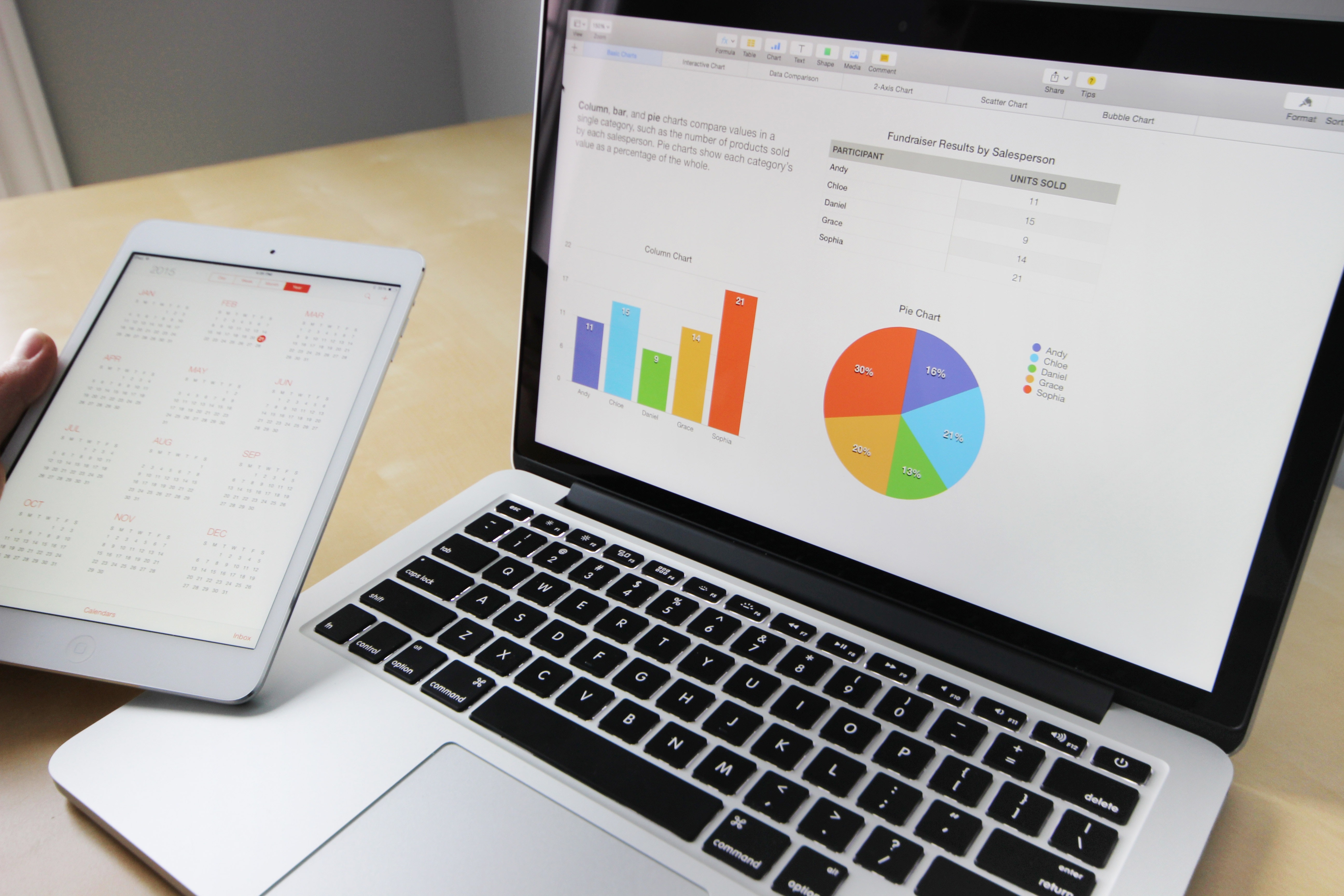
Tableau Public is a free service for Mac and Windows that lets anyone create and share interactive charts and graphs, maps and live dashboards. Designed for ordinary people, the software is very intuitive. No programming skills of any kind are required. Simply drag and drop data into the canvas and immediately start to see results and answer questions. For help, you can check Tableau’s online tutorial videos and live training.
Tableau is constantly adding new features and enhancing the experience based on users’ suggestions. It has recently released Tableau Desktop, Public Edition 9.2. The new version offers, among other things, Mapbox integration, allowing for great-looking map backgrounds, layers, and context.
Tableau Public offers 10 GB of storage space and works with data from Microsoft Excel, Microsoft Access, multiple text file formats, statistical files, and web data connectors. Moreover, it does a lot of the work for you in figuring out what the data type is. Per workbook, the limit is 10,000,000 rows of data.
One thing to take into consideration is that once you publish a workbook to Tableau Public, anyone can view the data. However, you can disable the ability to download the workbook.
If you have a tablet, you can explore data with your hands with Vizable, Tableau’s free app.
Good news for students: You can get a free Tableau Desktop license if you are enrolled full-time at an accredited school anywhere in the world.
Take a look at the gallery to see the many ways in which people are using Tableau.
Fusion Tables is Google Research’s free experimental application for data management, integration, and collaboration:
- Visualize hundreds of thousands of rows of data using charts, maps, and graphs.
- Merge tables and/or combine with public data. Keep track of who owns what by specifying attribution for the data.
- Host data online and share it with others just like you do with Google Drive. Most tables are private by default. If not, you can disable the downloading option.
- Charts or maps hosted in Fusion Tables will automatically update when you improve your dataset.
- Although programming skills are not necessary to use this tool, there is an API available for developers who want to build applications over Fusion Tables.
Fusion Tables’ ease of use is intermediate –definitely not as intuitive as Tableau– since mapping and dataset merging can require some effort. For help, a list of tutorials can be found here.
Fusion Tables supports a quota of up to 1 GB per user. You can import different file types including CSV, TSV, KML, Excel, and Google Spreadsheets. There are hard limits of 5,000 columns per table and 1 million characters per cell. For better performance, Fusion Tables recommends keeping the number of columns below one hundred and the total size of data in the row below 1 MB.
An option to suggest new features is available on the website. However, no new features have been added since 2014.
Check the gallery to see what people are doing with Fusion Tables.
Photo credits:
Pexels.com. Image made available underCreative Commons Zero Generic License. Last viewed on May 29, 2018.